Graze Together was one of my very first end to end UX projects, and I often look back on it as a clear marker of how much my skills have grown
since then. At the time, it challenged me to think beyond visuals and focus on real user needs while working within the realities of a small
business. Although the app was not launched due to the founder’s maternity leave, the final design was implementation ready and well received
by both users and the client.
This project taught me how to balance user needs with business constraints, communicate effectively with a small business owner, and adapt
quickly when project scope and timelines changed. More importantly, it helped me build confidence in translating research into practical design
decisions. If I were to revisit this project today, I would rethink parts of the layout for improved clarity and scalability, and introduce additional
features to better support repeat customers. These would include a lightweight backend for order tracking, an automated follow up system, and a
one click re order experience to reduce friction for returning users.
Overall, Graze Together was a meaningful learning experience and a foundation for my growth as a designer. It reminds me how far I have come
and continues to shape how I approach designing thoughtful, human centered solutions for real people and real businesses.

02
Graze Together
OverView
Timeline
My Role
Figma
1 Month
UX Designer
UX Research
Tools
With growing demand, the founder struggled to manage custom orders through instagram DMs. This lead to confusion, delays, and missed sales.
She needed a centrailzied soultion to streamline ordering, reduce ghosting, and free her up to focus on what she loved : creating charcutie boards
Problem Statement
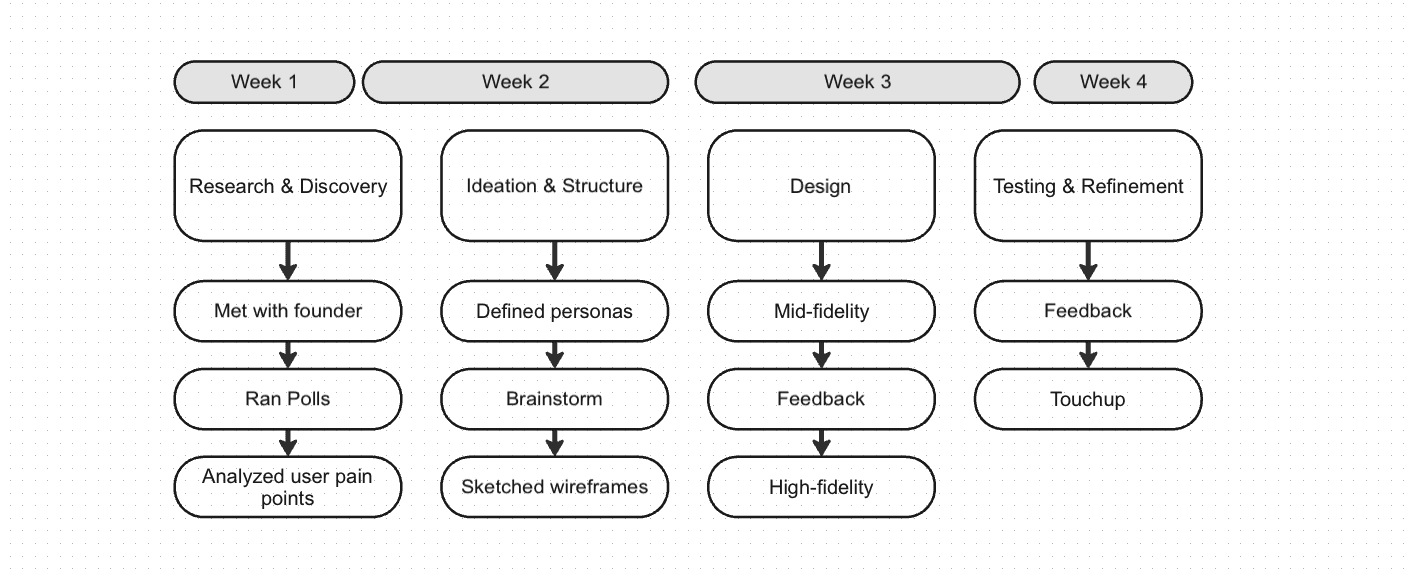
Process
User Persona
Mid Fidelity
Using Figma, I created two mid-fidelity wireframes to define layout structure, screen hierarchy and the user journey with more clarity.

Feedback & Iteration
Testing and Validation
Final Design
Initial testing revealed that while users appreciated the simplicity of the app, they wanted clearer feedback after submitting an order
and more visual cues throughout the menu page
- Added visual preview images and descriptions to each board option
- Designed a confirmation screen with an estimated response time and next steps
After incorporating these changes, I moved into the high-fidelity design phase, refining the UI to match the brand’s aesthetic and ensure
a smooth, mobile-first user experience.
The final product reflected the brand’s modern, handcrafted aesthetic while simplifying the customer experience.
Reflection
About a 4 week process
Research & Insights
Instagram Polls : I launched a short poll through the business’s Instagram Stories, the same place where most ordering interactions originally
happened. Within 48 hours, I received 51 responses from a mix of past and potential customers. The goal was to gather quick feedback on
their experience ordering via DMs and to understand what they wished existed instead.
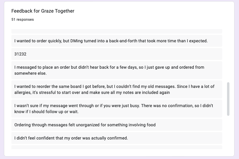
Customer Quotes

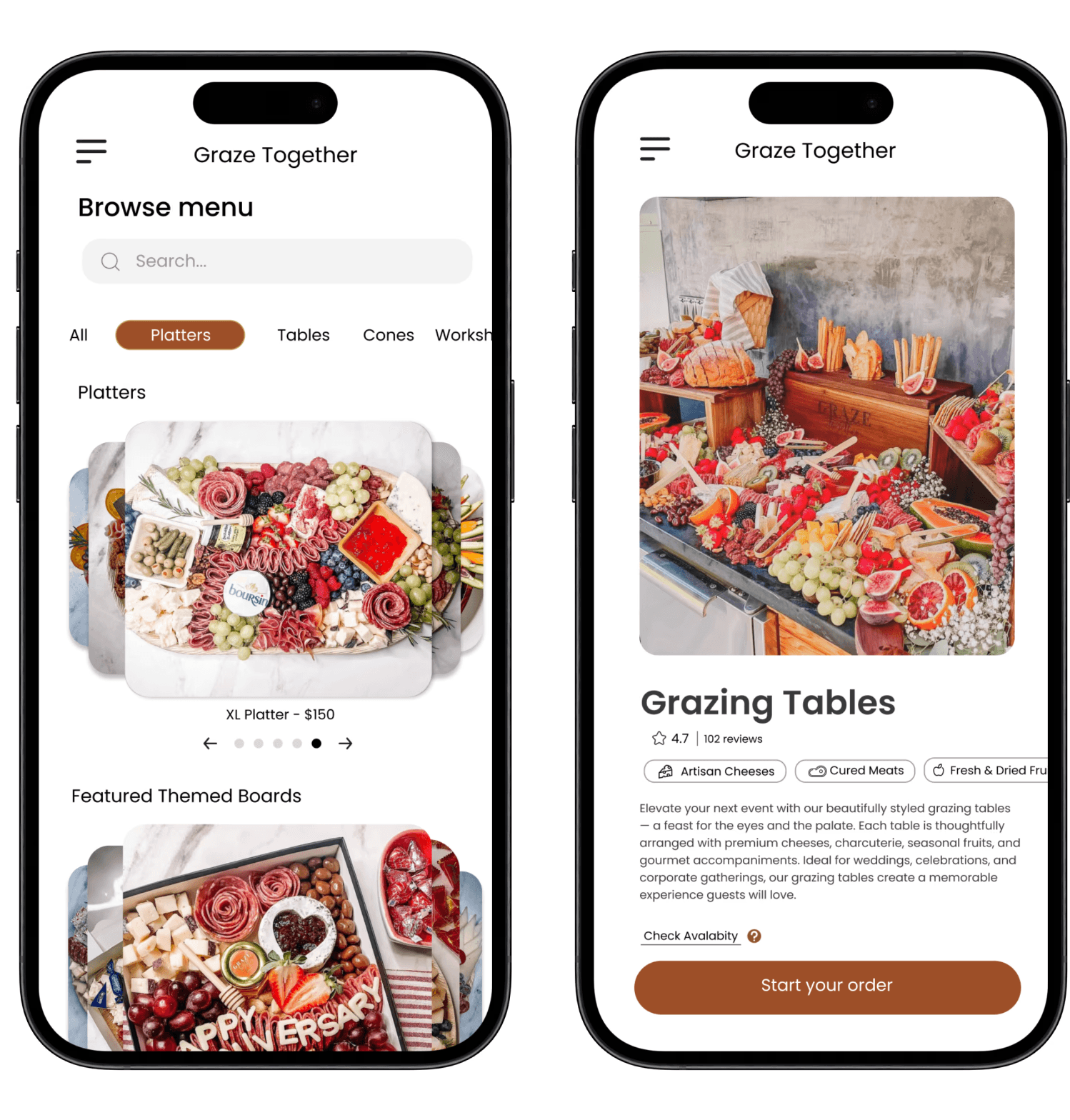
Homepage / Browse Menu
The homepage highlights available board
options with clear visuals, pricing, and
categories for quick browsing. Designed
with a mobile-first layout, it allows users to
explore effortlessly without needing to
message the owner.

Direct feedback from customers revealed how communication gaps and uncertainty impacted their willingness to order. These insights highlighted the
need for a more transparent and structured experience.
Many small businesses launch on Instagram for its accessibility and visual appeal. But as orders grow, managing custom requests via DMs becomes
inefficient. I partnered with a Seattle-based charcuterie business to design a pre-order app that reduces friction, streamlines requests, and helps
the founder reclaim time.


Homepage &
Menu
Q&A Page
The homepage highlights available board
options with clear visuals, pricing, and
categories for quick browsing. Designed
with a mobile-first layout, it allows users to
explore effortlessly without needing to
message the owner.
A dedicated Q&A section helps customers
find quick answers about board sizes,
pickup options, and customization details.
This reduces repetitive messages for the
owner while improving clarity and customer
confidence before ordering.

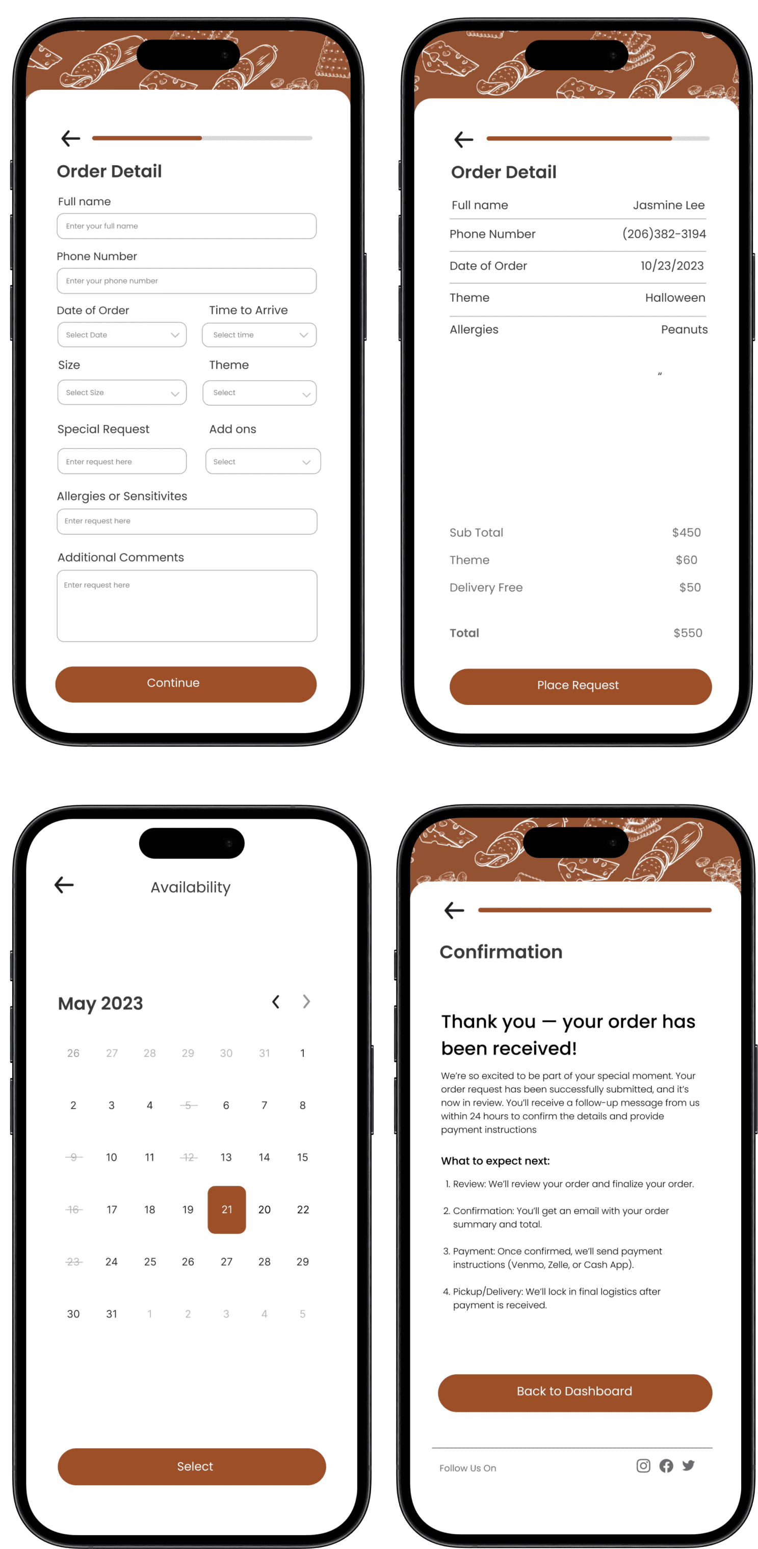
Order Flow &
Confirmation
Users can easily complete their order in
a guided, step-by-step flow, filling in
details like name, date, size, and theme
before reviewing a clear summary. The
process ends with a friendly confirmation
screen, reassuring customers their order was
received and outlining next steps.
I created user personas based on research to represent the core needs, frustations, and behavors of typical customers, helping guide design
descions with empathy and clarity
To validate the design and ensure it aligned with user needs, I conducted small-scale usability testing with 4 participants who
matched the business’s customer base, including busy customers and event planners in the Seattle area. These sessions focused on
core tasks such as browsing the menu, submitting an order, and navigating the form flow.
Given the project scope and time constraints, testing was conducted remotely using clickable Figma prototypes. The goal was
to observe how easily users could complete an order without needing outside guidance.