ThreadBoard
Duration : 3 Weeks Role : UX/UI Desinger
2022
Overview
ThreadBoard is an all-in-one, web-based dashboard designed for small clothing business owners to manage their operations efficiently. With real-time updates, intuitive navigation, and clear data visualization, it enables users to monitor sales performance, track inventory, view customer feedback, and manage staff—all in one place.
Problem Statement
Small clothing business owners often juggle sales tracking, inventory management, customer communication, and staff coordination using multiple disconnected tools or manual methods, which creates inefficiencies, delays in decision-making, and missed
opportunities for growth. The challenge was to design a single, intuitive platform that consolidates these tasks into one accessible dashboard and provides real-time insights without overwhelming the user.
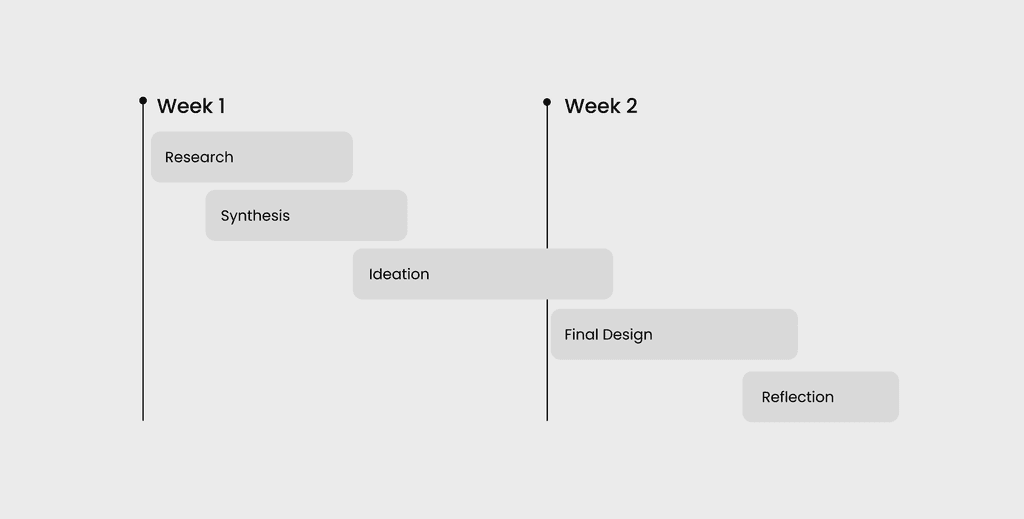
Process
Over three weeks, I followed an iterative design process from research to final prototype. Starting with user interviews, I identified key pain points and translated them into personas and insights. I then explored solutions through content mapping, sketches, and mid-fidelity wireframes before refining the experience into a polished final design.
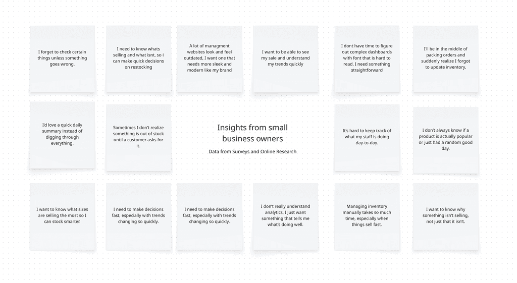
Research & Insights
To better understand the needs of small clothing business owners, I conducted user interviews to learn how they currently manage inventory, track sales, and handle day-to-day operations. I focused on identifying common challenges, inefficiencies, and gaps in existing tools, as well as what users would value most in a management platform.
Through this research, I uncovered key patterns around the need for simplicity, real-time visibility, and faster decision-making, which directly informed the direction of the dashboard design.
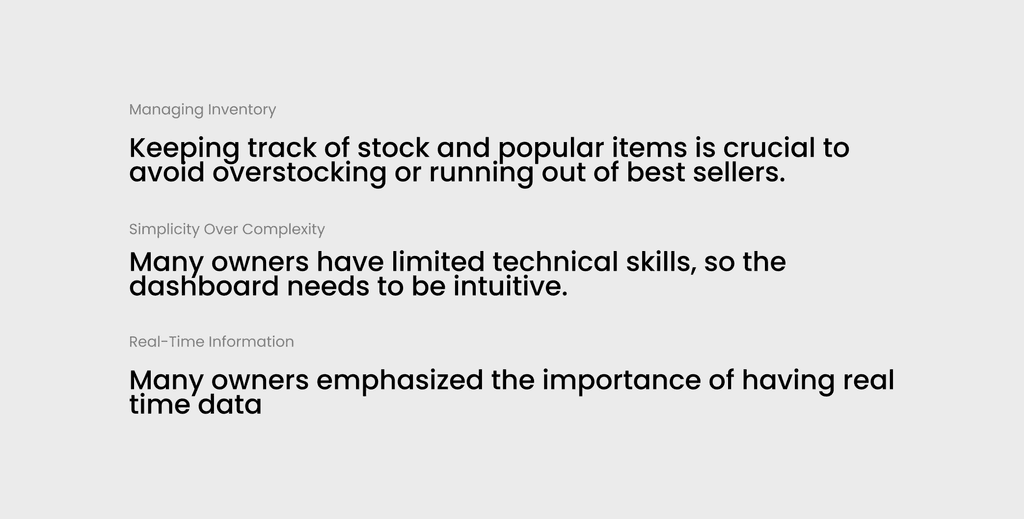
Key Insights
These insights highlight the core challenges small business owners face and reveal a clear need for a simple, intuitive dashboard that provides real-time visibility and supports quick, confident decision-making.
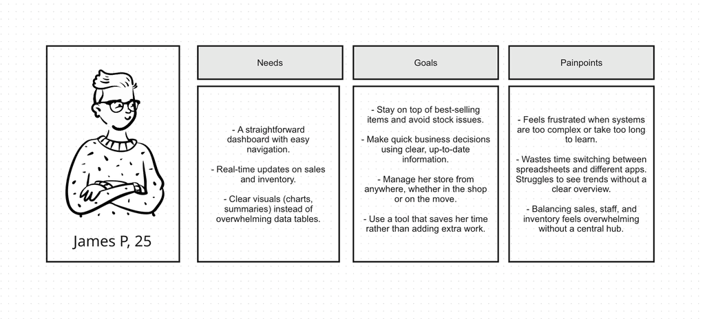
User Personas
This persona represents a core user type identified through research and helps ground design decisions in real needs, behaviors, and frustrations.
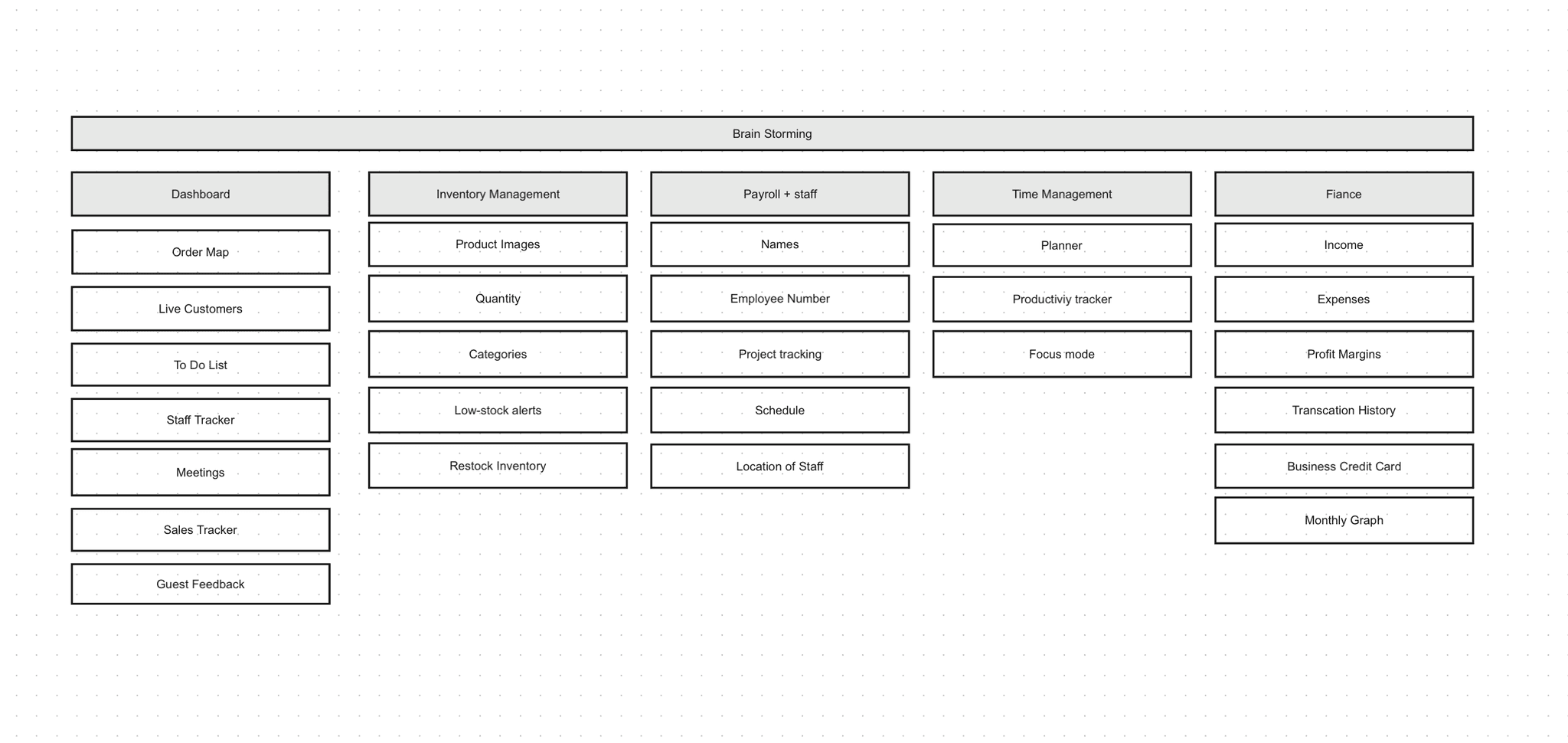
Content Mapping
Before jumping intro designs, I used Miro to brainstorm. I laid out ideas for each page of the application and filled them with possible content and features. This helped give me a big-picture view of the user flow.
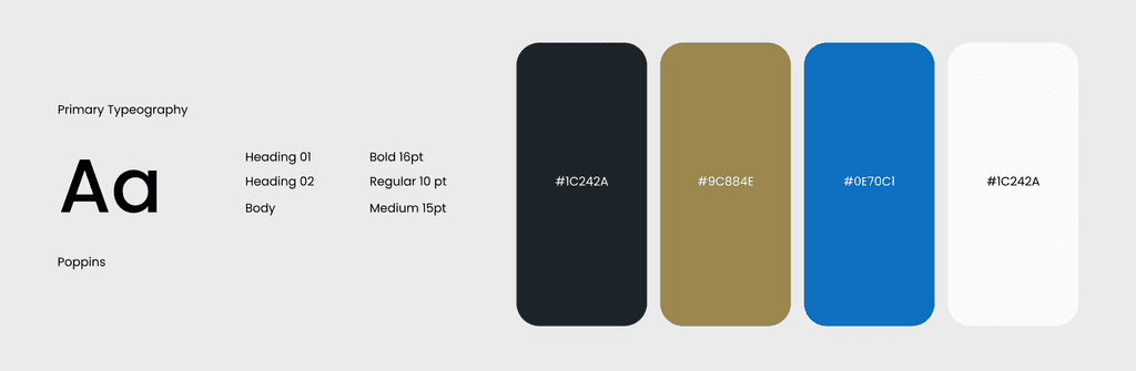
Visual Design
Before jumping intro designs, I used Miro to brainstorm. I laid out ideas for each page of the application and filled them with possible content and features. This helped give me a big-picture view of the user flow.
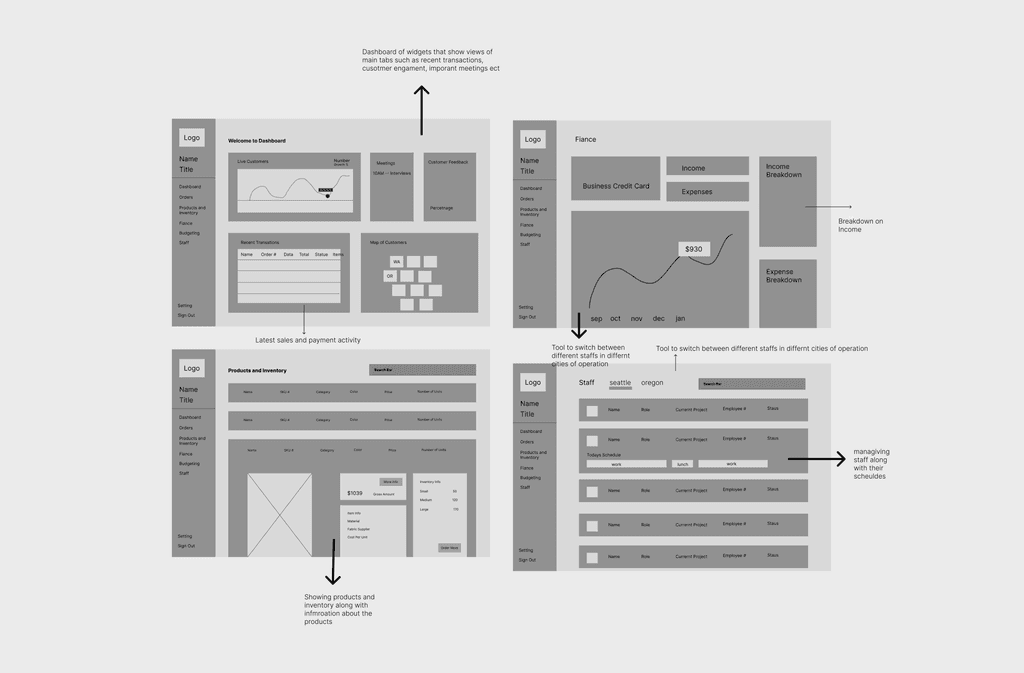
Mid-Fidelity
Using Figma, I created two mid-fidelity wireframes to better define the layout structure, establish a clear screen hierarchy, and map out the overall user journey with greater clarity. At this stage, I focused on organizing key content, refining navigation patterns, and ensuring that interactions felt intuitive and aligned with user needs. These wireframes helped bridge the gap between initial concepts and higher-fidelity designs, allowing me to translate ideas into a more structured and functional experience.
Final Design
To address these challenges, we will implement a comprehensive project management overhaul. We'll introduce a task assignment system, enhance communication channels, and establish a clear file organization structure. A centralized hub will provide easy access to vital data, improving decision-making and evaluation. We'll also create standardized project update and performance metric documentation. This holistic solution will streamline processes, reduce stress, and elevate work quality, enabling us to better meet client expectations and support our business growth.
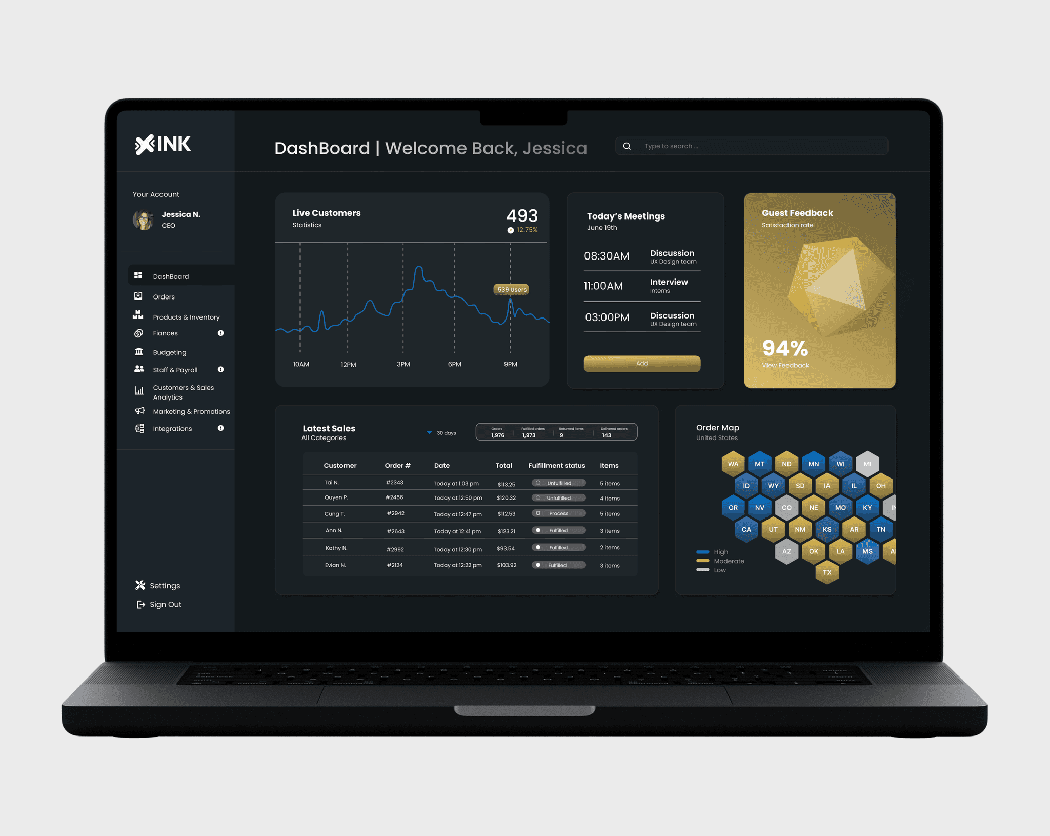
DashBoard
The main dashboard displays key metrics like live customers, meetings, recent sales and ect in a modern widget layout. It provides a clear overview of business performance, helping owners quickly interpret data and make informed decisions
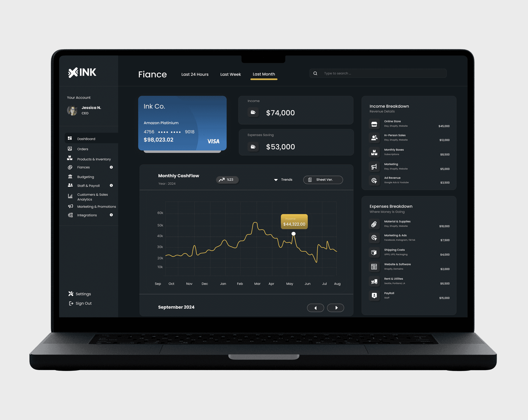
Fiance
The finance page visualizes the business’s financial health through clear income and expense breakdowns, including categories like in-person sales, ad revenue, and shipping costs. A dynamic graph tracks monthly cash flow, helping users identify revenue trends at a glance. The modern, data-focused layout ensures complex financial information remains easy to read and actionable.
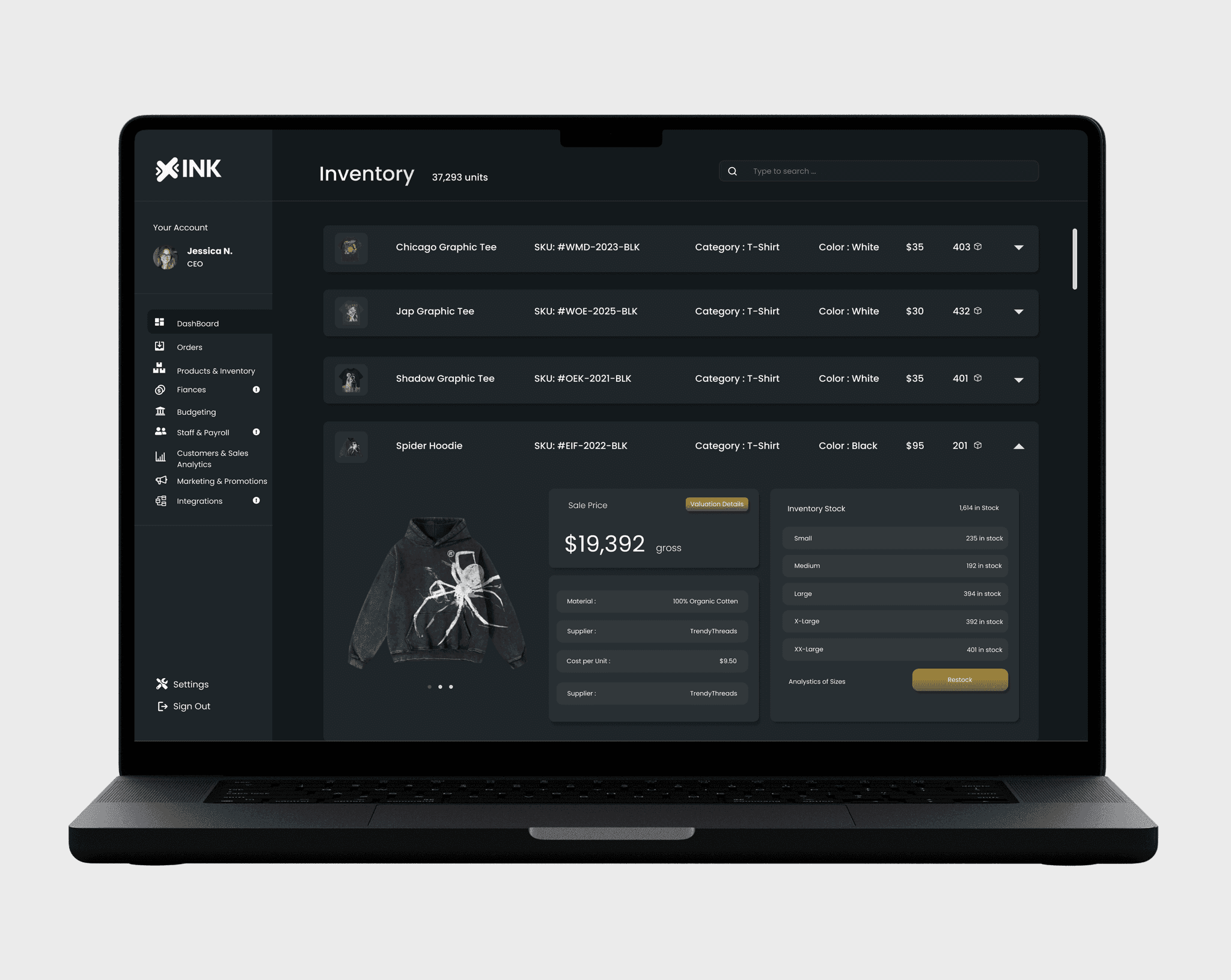
Inventory
The inventory page provides a detailed view of each product, including category, color, price, material, and available stock. Business owners can easily track quantities and restock items with a single click. The clean layout prioritizes clarity, making it simple to manage products and maintain balanced inventory levels
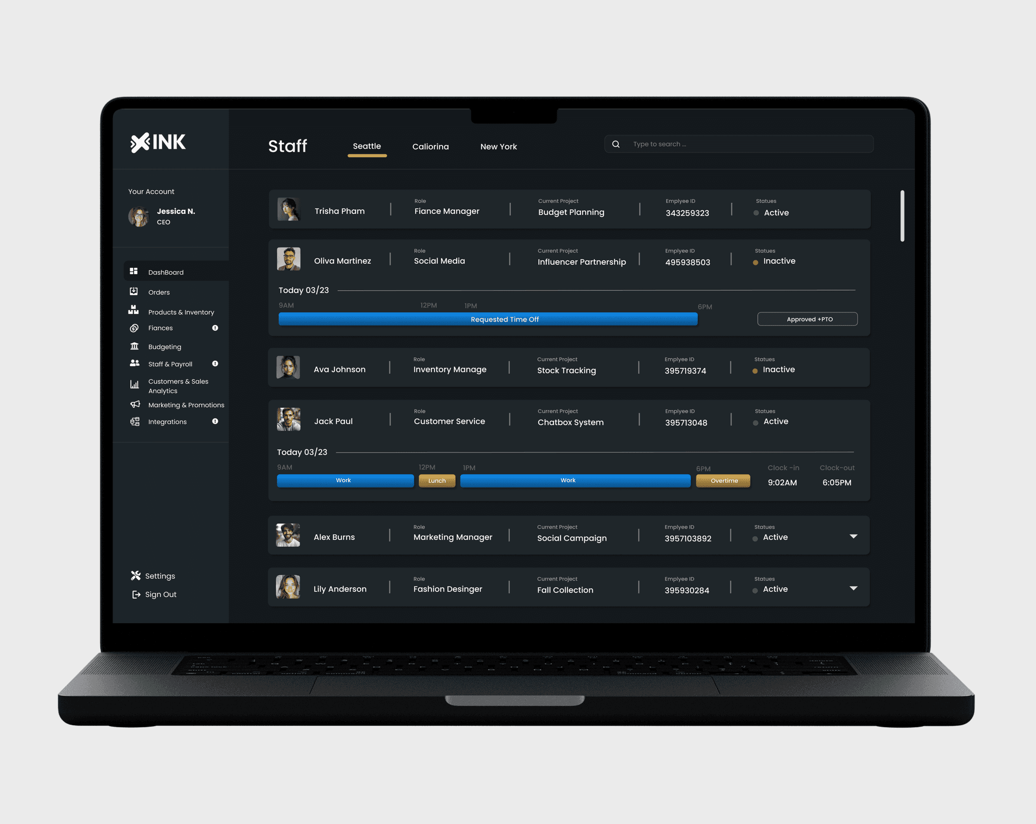
Staff Management
The staff management page shows each team member’s schedule, role, and status in a clean, organized layout. Designed for efficiency, it helps business owners manage their teams seamlessly and maintain a professional look.
Reflection
This project was a true passion that allowed me to bring together my design skills and my interest in supporting small business owners. As a self-initiated case study, it gave me the freedom to explore the entire UX process, from initial research to final design, without constraints. One of the most rewarding aspects was identifying real pain points faced by small clothing business owners and crafting solutions that felt intuitive, efficient, and visually cohesive.
Through this process, I deepened my understanding of user-centered design, improved my ability to translate research into actionable features, and strengthened my proficiency in creating complex dashboards that remain accessible and easy to navigate. More than just a design exercise, this project reaffirmed my belief in the power of thoughtful design to make everyday work simpler and more empowering, especially for small businesses trying to do more with less.